 Skip to content
How Logo Placement Affects Whether a Logo Gets Seen
A logo does not become visible simply because it appears on a promotional product. Where you place it often matters as much as its size, colour or design.
A large print on the wrong side of a bag may face the wearer rather than everyone around them. Branding on a bottle can disappear behind someone’s hand, while a logo placed too low on a shirt may fold when the wearer sits down.
These details matter even more when your business orders promotional products wholesale, as one poor placement decision can affect 100, 500 or even several thousand items.
Why Does Logo Placement Matter?
Logo placement determines who sees your branding, when they see it and whether the product’s normal use hides, folds or distorts the design.
Good placement works with the product rather than treating it like an empty surface.
A notebook logo should remain visible when the notebook sits on a desk. Branding on a cap should face the people around the wearer. A logo on a tote bag should sit on the panel that faces outward while someone carries it. The most effective location is not always the largest available print area. It is the area that stays visible during normal use.

Where Should a Logo Sit on Common Promotional Products?
The best position depends on how people hold, wear or carry the product, as well as which surface naturally faces other people.
Let’s look at this table for suggested logo placement:
Items | Placement that usually works well | What may reduce visibility |
| Tote bags | Centre of the main front panel | Printing near the base or across pockets and seams |
| Backpacks | Upper front panel | Branding on the side that rests against the wearer |
| Drink bottles | Upper or middle section of the body | Printing where the hand normally grips the bottle |
| Polo shirts | Left chest or upper back | Placing the logo too close to buttons, zips or seams |
| T-shirts | Upper chest or upper back | Low prints that fold when the wearer sits |
| Caps | Centre of the front panel | Designs crossing heavy seams or curved edges |
| Pens | Along the visible side of the barrel | Logos hidden behind the clip or fingers |
| Notebooks | Centre or upper third of the cover | Branding too close to the spine or bottom edge |
| Umbrellas | Opposite or repeated panels | Using only one panel that may face away |
| Lanyards | Repeated along the strap | A single logo that disappears when the strap twists |
Be aware that these placements are not fixed rules. Product shape, branding area and artwork size may change what works best. However, they help prevent common visibility problems before production begins.

How Does Product Use Change the Best Position?
The strongest branding position follows the way recipients naturally interact with the item, including how they hold it, wear it, store it, or display it. For example, a coffee cup. A logo may look well positioned on a flat artwork proof, but the recipient’s hand could cover it every time they take a drink.
The same issue appears across other products:
- A backpack logo should face away from the wearer.
- A pen logo should remain visible while someone writes.
- A shirt logo should not disappear beneath a jacket.
- A notebook logo should face upwards when placed on a table.
- An umbrella logo should remain visible from multiple directions.
Think about the product in motion, not just how it looks in a catalogue image.
For event giveaways, distance also matters. Small chest branding may suit staff uniforms and customer conversations, while a larger upper-back print can make a team easier to identify across a venue.
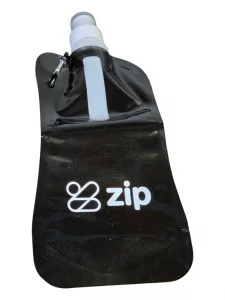
How Do Size, Contrast and Detail Affect Visibility?
Even a well-positioned logo may go unnoticed when it is too small, lacks contrast or contains details that become unclear at production size.
Artwork often looks sharper on a large computer screen than it will on a pen, keyring or small section of apparel. Fine text, narrow lines and detailed symbols can lose clarity once reduced.
For better visibility on promotional products:
- Use clear contrast between the logo and product colour.
- Simplify detailed designs for small branding areas.
- Keep text away from edges, seams and curves.
- Give the logo enough clear space around it.
- Review the artwork at its actual production size.
- Consider repeated branding on products that turn or twist.
A larger logo is not always better. Oversized branding can look crowded or make the product less appealing to use. The aim is to make the design noticeable while keeping it suitable for the item.
Does the Branding Method Change the Placement?
Each branding method works best on particular materials and surfaces, so the chosen process can limit the available position, size and level of detail.
For example, embroidery works well on polo shirts, jackets and caps, particularly across stable fabric panels. However, very small text and fine design details may not reproduce cleanly in thread.
Meanwhile, pad printing suits many smaller or curved products, including pens and selected drinkware. Screen printing often works well across flatter areas such as tote bags and T-shirts.
Digital printing can reproduce detailed or multicoloured designs on suitable products. Laser engraving creates a durable finish on compatible materials such as metal, but it does not produce the same colour contrast as a printed logo.
You should consider the branding method and placement together. Choosing one without reviewing the other can result in artwork that does not suit the product’s surface.
What Should You Check Before Approving a Wholesale Order?
Before production, review the logo on the actual product template and confirm that its position, scale, colour and branding method support clear visibility.
Here is what your business needs to confirm:
- The exact logo position
- The available branding dimensions
- The artwork size at production scale
- The contrast between the logo and product
- The chosen branding method
- The readability of small text
- Any nearby seams, pockets, handles or curves.
- Whether one-sided, two-sided or repeated branding is available
A virtual mock-up can help you assess these details before the full wholesale order enters production. Look beyond whether the logo is technically centred. Check how the product will appear when someone actually uses it.
The right placement helps each item create more opportunities for your logo to be noticed. Across a wholesale order, that small decision can make a meaningful difference to the campaign’s overall visibility.
Ready to Order in Bulk?
Choose the promotional product first, then match the logo placement to how recipients will use it. By reviewing the position, size, contrast, and decoration method before production, your business can avoid branding that appears technically correct yet remains difficult to see.
This simple review can improve visibility across the entire wholesale order and help each promotional product generate more brand exposure.


