 Skip to content
 If you want to put your brand out there, then use a tried and true marketing strategy which is giving away promotional products. One of the most frequently bought items in our collection are promotional t-shirts. However, all your promotional efforts will be thrown away in a bin if your t-shirt is poorly designed. Do you want to distribute a custom tee that people will actually wear for a long time? Read on to learn how.
- Know your audience for custom t-shirts.
- Use contrasting colours and simple designs.
- Choose high-quality, on-brand shirts.
Designing Impact: The Basics
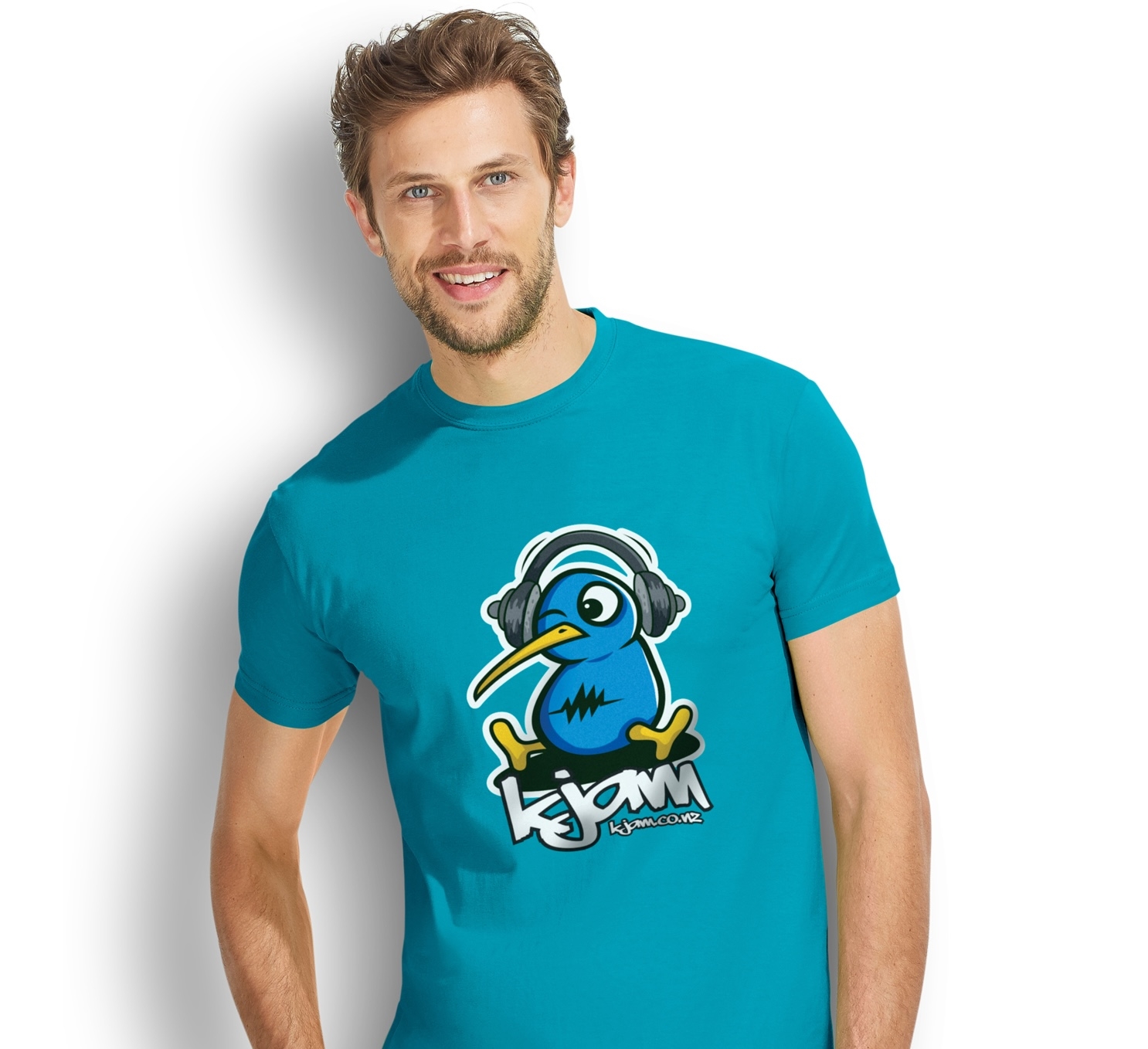
Whether you’re looking to raise awareness for a cause, promote your brand, or create a memento for a special event, a promotional t-shirt is a go-to choice for many. After all, it’s portable, affordable, and a walking billboard for your message. But with so many t-shirts out there, how do you make yours stand out from the crowd? It all comes down to design. Here are some basics to consider when designing your promotional t-shirt.
- Know your audience: Before you start designing, think about who you’re making the t-shirt for. This will determine what kind of design will work best. Is it for a young and hip crowd? Then consider using bold colours and edgy typography. Is it for a more corporate event? Then opt for a more subtle and professional design.
- Keep it simple: Don’t try to cram too much into your design. A simple design will be more effective than a cluttered one. Think of some of the most recognizable logos out there- Nike, Apple, McDonald’s- they’re all simple, yet effective.
- Make it memorable: What’s the point of a promotional t-shirt if no one remembers it? Use eye-catching and memorable designs that people will want to wear time and time again. Consider incorporating unique details like metallic or glow-in-the-dark ink.
The Power of Colour
Color plays a huge role in the effectiveness of your promotional t-shirt. Here are some things to keep in mind when choosing your colour scheme.
- Colour psychology: Different colours can evoke different emotions in people, so consider the message you’re trying to convey. Red is associated with passion and excitement, blue with calmness and serenity, and green with nature and wellness.
- Colour contrast: High contrast colours make a design stand out. So if you’re using a dark colour for your t-shirt, consider using a light colour for your design, and vice versa.
- Colour limitations: Keep in mind that not all colours are achievable when screen-printing, especially on darker t-shirts. So be sure to work with a printer who can help guide you through what’s possible.
Beyond Design: The T-Shirt Itself
The t-shirt you choose for your promotional product can make all the difference in how effective your design is. Here are some things to consider when choosing your shirt.
- Quality Matters: Make sure you choose a high-quality t-shirt that not only looks good but feels good too. People are more likely to wear a shirt that feels comfortable and looks good.
- Complimentary Cut: Different body types require different cuts of t-shirts. For example, a women’s cut t-shirt will fit differently than a traditional unisex t-shirt. Make sure you choose a cut that will flatter the majority of your audience.
- On Brand: If you have a brand style guide, make sure your promotional t-shirt follows those guidelines. Consistency is key to building a strong brand identity.
Takeaway
Designing an effective promotional t-shirt takes time and effort, but the results can be well worth it. By following these basics of design, incorporating colour psychology, and carefully selecting your t-shirt, you can create an eye-catching and memorable promotional product that people will be proud to wear. And who knows, maybe you’ll see your t-shirt out in the wild being worn by someone you’ve never even met. Cheers to impactful design!


